How to Make your WordPress Site Mobile Friendly
If you’ve not heard the fun news, recently Google dropped a little bomb. All websites need to be mobile friendly by April 21st:
“Starting April 21, we will be expanding our use of mobile-friendliness as a ranking signal. This change will affect mobile searches in all languages worldwide and will have a significant impact in our search results.”
In other words, if your blog *isn’t* mobile friendly by then, they are going to start tanking your posts in search results.
Good times.
How to Make your WordPress Site Mobile Friendly

Following this discovery, I have been wrestling with my site for the past week or so. Trying to get it mobile friendly for Google, because I’ve got nothing better to do. Hair has been pulled. Tears have been shed. Google has been cursed.
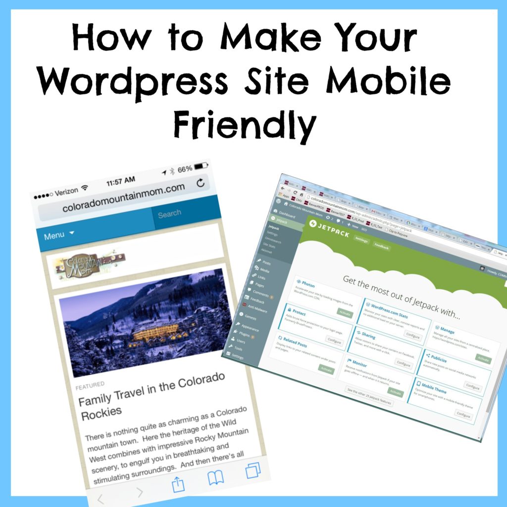
Anywhoo – It’s working now… and I discovered an easy tip, for any of you self-hosted WordPress bloggers: Jetpack can serve up a mobile version of your site for you! Whaaaat?
Mine is a self-hosted WordPress blog, using the Genesis theme plus a child theme (called Adorable, which is no longer supported). I took a couple of steps to get to Happy Mobile-Friendly Land. I’m not 100% certain if the first one is required, but I’ll include it just in case it is.
1. I added a viewport meta tag. Under “Appearance – Editor”, you have access to edit your (theme, or child theme’s) functions.php file. View it, find a place near the top after <?php, and paste in the following code. Then save by clicking “Update file”:
//* Add custom Viewport meta tag for mobile browsers
add_action( ‘genesis_meta’, ‘sp_viewport_meta_tag’ );
function sp_viewport_meta_tag() {
echo ‘<meta name=”viewport” content=”width=device-width, initial-scale=1.0″/>’;
}

2. I clicked “Activate” on the Jetpack’s “Mobile Theme” feature (lower right, in photo below).

The mobile version will now display if someone accesses my blog via a mobile device, but will not affect my normal theme’s look. There are a couple of simple configurations you can play with (display feature photo or not, display excerpt or full article). But that’s it!

Taaa-daaah!! This solution was so simple, I could weep with joy. It was downright comical after all I’ve been through trying to figure it out.
Mobile Friendly Test
You can use Google Developer’ s Mobile Friendly Test here to test out your site, by entering in your blog’s URL.
I hope this helps save someone time and unnecessary angst, in getting their site up to mobile friendly snuff!
*o* *o* *o*


